Sunday, January 31, 2010

Old NOTD: Sally Hansen Insta-Dri Jumpin' Jade

I got this polish off of eBay... and received it securely wrapped and covered in nail polish a couple of days later. It doesn't seem like a lot has leaked out but still -- grr!

Sally Hansen Insta-Dri Jumpin' Jade

This wasn't a particularly special color for me. Dark green shimmer. Nice. Not special. But nice. The bigass brush performed very well on most fingers... except my pinky, where it flooded it and was impossible to clean up because the polish was so pigmented. Two coats, somewhat uneven application (probably due to the polish thickening from being slightly open for probably days before I received it). I put Diamont over it though it almost wasn't necessary since it was practically dry after I applied it. The photos above were taken a day after applying: just a slight bit of tipwear, not bad at all. Removal, however... oh man. My nails used to be stained yellow... I swear to god, they're green now. A sickly, ugly green. :(

The reason I decided to post this was because I had just posted that whole long thing on making my own lightbox: I wanted to show a comparison of how photos turn out using natural light vs. lightbox. The first photo was taken using a lightbox, the second photo was taken in the sunlight. In the case of this dark green shimmer, there's not much of a difference: the only way I can tell the difference is that the reflection on the first photo shows the lightbulb and the reflection in the second photo shows the sky (which makes it slightly more blue).
read more "Old NOTD: Sally Hansen Insta-Dri Jumpin' Jade"

Old NOTD: ManGlaze Matte is Murder

Out of all the matte blacks I've tried so far, I still think I like ManGlaze's best. It's not the cheapest but it is the most matte and most interesting of the bunch.

ManGlaze Matte is Murder
Ignoring the dumb dent that I made on my index finger when I decided to type before ten minutes were up, I just love this mani. Matte is Murder is the new, improved version of ManGlaze The Death Tar: it seems to be a bit darker and has more hidden shimmer in it than its predecessor. It's a perfectly matte surface, applies beautifully and, unlike a lot of mattes, is very forgiving: it dries quicker than most polishes but it doesn't dry so quickly that mucking up one stroke is going to totally ruin the finger. This was my NOTD and it held up very well, given that mattes usually are chiptastic on me immediately.

ManGlaze Matte is Murder with "David" topcoat

Here is Matte is Murder with a glossy topcoat. Unfortunately, I didn't manage to get any daytime pics, otherwise, you could see the multicolored shimmer that comes out when you put a glossy topcoat on it. I actually prefer this matte. This was a real pain to remove, as are most black polishes: I had grey fingers for several hours afterwards. But that's the price you pay when you wear black!

read more "Old NOTD: ManGlaze Matte is Murder"

Saturday, January 30, 2010

Essie Body Language: a freak polish for a freak snowstorm!

Sadly I ruined my Laura Mercier Caviar Dreams manicure last night! :( I was making dinner for a friend and chipped it in several places (I was rushing and being extra violent with my poor fingers). Despite my disappointment, it did give me an excuse to repaint my nails! I'm not usually someone who changes their polish every day - I'm more of an 'every 3 to 4 days' kinda gal, but I did feel like something lighter.

We had a snowstorm last night (does not happen often around here...) and I feel like my polish choice reflects the weather - icy, cool, crisp and out-of-the-ordinary! After wearing darks for the last couple weeks it feels somehow cleansing to put this polish on...like jumping into a bed with freshly washed sheets!


Application was good - but then again I'm a big Essie fan. The first coat went on streaky, but the second one cleaned it up no problem. I did notice that as the first coat dried a bit, it seemed to even out considerably. I feel like I had good control of this polish - the brush is the perfect 3-strokes-to-cover the nail size for me. I know many complain about Essie's little brushes, but I seem to get along with them. Once again this is no clean-up because it was about 1am when I did this, but who are we kidding - I hate clean-up and almost never do it anyways.

There is something odd yet wonderful about this colour. It's like the platypus of the nail polish world! It's made up of seemingly random parts thrown together for some sick little experiment, but the end result is kind of adorable in a bizarre way. It looks quite grey indoors, shows more of a lavender cast outdoors, and I think it's just really pretty! Body Language isn't your run-of-the-mill light colour either - there is something decidedly odd about it. Maybe this is RBL Grunge's little sister - a work-appropriate neutral with a little daring edge to it.

All I know is that this little platypus freak has definitely burrowed its way into my heart and into my permanent collection. :)

kittytokaren

P.S. Let me know what you think! Too weird? Would you wear this colour? Does it give me alien hands?
read more "Essie Body Language: a freak polish for a freak snowstorm!"

Old NOTD: No Miss Gainsville Green and layered with China Glaze Doll House, Or: Mani Fail

My love of minty green continues. My love of No Miss pretty much died before it began.

No Miss Gainsville Green


I love the delicate, milky, jelliness of this very light mint green. Unfortunately, this was hell to apply: streaky and sheer until the fifth coat... and gloopy to boot! Not fun at all. But I love the color so much, I've decided to keep it for a bit (usually, adding thinner and Wet N Wild clear works wonders on difficult polishes). I bought a whole bunch of No Miss online and have promptly regretted that decision. (Stay away from the glitters: they are very sparse.) I have other No Miss polishes but after the exceptionally difficult application of this one (and the disappointment of seeing the glitters in person), I don't have much of a desire to try any of them anymore. Still! This one is super pretty, if you have the patience for it.

No Miss Gainsville Green with China Glaze Doll House

This whole experience was just one big mani fail. I wanted Doll House so badly but it really doesn't look that great on me... especially over Gainsville Green. It's large warm pink hex glitters in a clear base with some warm pink microglitter. I love the way this looks in the bottle though.

Right after I put on this mani, I realized that I had a meeting with two of my RAs. Way to look professional, huh? I looked like my nails had caught some sparkly weird pox of a disease.

read more "Old NOTD: No Miss Gainsville Green and layered with China Glaze Doll House, Or: Mani Fail"

Friday, January 29, 2010

We are building a religion...

...a limited edition!

Laura Mercier Caviar Dreams to be exact. This was a limited edition polish from the Winter 2008 Black Tie Collection. I just acquired this beauty and I just have to rave! It is a gorgeous polish with a dark charcoal base that shimmers a vibrant emerald green or sometimes when you least expect it, a deep eggplant. I thought the best way to describe this polish was like black pearls - it has the same iridescent qualities that change in the light.

I tried my best to capture her different personalities:

Can you see the hint of aubergine shimmer?


The green shimmer is more vibrant in real life!

The one problem with this polish - application! It's a shame because I think the formula is actually pretty decent - this was two coats of highly pigmented glory. The brush is just so cumbersome that it makes applying it feel like you're trying to land a 747 on a postage stamp. The bottle looks much like Chanel bottles - it has a large square cap. (See pic below!) However, while with Chanel you can slide off the square cap to reveal a much more dextrous, more petite brush handle, this square cap is attached to the brush - ugh! But to me, this polish was worth the trouble. Its gorgeous. Elegant, but somehow very intriguing...


And now I wouldn't feel right showing you a limited edition polish without suggesting an obtainable alternative! Although I don't own it to swatch it - from the pictures I've seen/people I've talked to, Borghese Stellare Notte seems to replicate this fairly well. They are both deep charcoal bases with green and purple shimmer. From the looks of it the difference is that the purple is more prominent in the Borghese whereas the green is more prominent in Caviar Dreams.

Do any of you have Borghese Stellare Notte? What do you think?

On another note - I got a digital camera!! Yes, all of my photos have been from my phone. My awesome phone with auto-adjusting macro, but still a phone. I still haven't figured out my new camera so bear with me, but I hope to give you better pics in the future!

kittytokaren
read more "We are building a religion..."

How to Make Your Own Lightbox Tutorial!

Just letting everyone know that I have a backlog of emails and MUA PMs that I'm working through and I hope to clear out my inbox by next Monday. I am so sorry if I haven't responded yet to your messages!

Also... I am trying a bit harder to keep up with comments. Safari hates the commenting system Blogger uses so I end up losing comments... and then end up being too frustrated to retype them. (Lame excuse, I know.) I will answer everything eventually, if very slowly. :(

And because mKat asked about my lightbox. Here it is! In all its amateur handmade glory.

My SO bought the materials to make it for me as an anniversary-of-our-meeting present back in December. Why? Because he knew it was hard for me to get swatching done in the winter! I'm on campus all day and by the time I get home, it's already dark. Flash swatch photos can be extremely color-inaccurate and the lighting in our apartment is insufficient to take good photos without flash. So to make my life easier, he wanted to build me a lightbox. (He thought of buying me one but they are too expensive.)

He went to Michael's, an arts and crafts chain, and bought the following materials:
  • Five 20x30 white foam core boards
  • Clear packaging tape
  • Four cheap clip-on lamps (though we ended up only using two) like these:
  • Four 100 watt (1750 lumens) EcoSmart True Color (compact fluorescent) simulated daylight lightbulbs like these:

  • You will also need a ruler, a pencil and a box-cutter.
n.b. Technically, any "daylight" bulb is supposed to be able to work but the first bulbs the SO bought (full-spectrum normal bulbs found at drugstores) were too yellow. The light needs to be white.

How to construct a cheapie-but-workable lightbox:
  • Decide how big you want your lightbox to be. Originally, my SO made it 20" x 20" x 20" which was ginormous for taking pictures of my nails. The lightbox I'm using now is the lightbox he made... except I took it apart and made it smaller. (And more lopsided. Not purposefully. His lightbox was much prettier before I redid it.) The dimensions of mine are 17" x 17" x 17".
  • Very lightly in pencil, outline the size you want your lightbox to be on your five foam core boards. Each piece should be the same size: in my case, 17" x 17".
  • Use the box-cutter to cut out the pieces, preferably using the ruler as a guide (I freehanded this and it was baaad). Be sure to do this on a surface that you are willing to destroy. I put down a couple of pieces of old cardboard on the carpeted floor underneath the foam core boards before I started cutting.
  • Tape the foam core boards together in the shape of a box (that's missing a side, obviously). Make sure that there's no gap between the boards that could let in light. If you are a sloppy cutter like me, this might be impossible. Just do your best. A few small gaps won't ruin the whole project. :) I wish I could offer better advice on how to do this step effectively. It took my SO the longest when he did it. It took me the longest when I redid it.
  • Find a place for the lightbox to live. Once you attach the lamps, it's a bit of a pain to move around.
  • Clip the lamps on either side of the box (you can use all four or just two, depending on the size of the box): apparently, the objective is to try to fill the box evenly with light rather than concentrating the light on a certain location within the box. I kind of ignore that and shift the lights around depending on what I'm lighting (very easy to do with adjustable clip-on lamps).
Lights off!

Lights on!

You can be totally done and happy with this... or if you're like me and think the thing's still too big and bulky, you can choose to recess the lights a bit by cutting out a rectangular section of two sides of the board.


If you know in advance you want to do this, do all the cutting in the beginning of the process rather than cutting out these rectangles out of a completed lightbox. Why? Because you might get something like this:


Unevenly cut rectangles (in addition to a lopsided box). Pretty ugly!

I do feel honor-bound to tell you that you might still need to fiddle with one or two camera settings to get a photo whose colors look true to life. My camera's "Smart Auto" function is kinda dumb: it takes pristine photos in non-ideal light and non-ideal photos in pristine light. When taking photos using my lightbox, I get around this annoying tendency of my camera by changing the EV (exposure value) to +0.3, which brightens the photos. I still like taking natural daylight photos when I get the chance -- especially because natural light is more forgiving on my often-dry cuticles -- but I'm now pretty comfortable taking photos of the following types of polishes using my lightbox:
  • Most cremes and jellies, including vampies, pastels and neons (except oranges and red-leaning purples, which are hard for me to capture regardless of light)
  • Most shimmers (except for light shimmers in a light base)
  • Most metallics, pearls, foils and frost
  • Single-colored glitters (like all gold, or all purple)
I still however leave photos of duochromes, holographics, flakies and multi-colored glitters to natural daylight. Any polish that is best shown with light bouncing off of it in different ways (and usually needs video to show off its awesomeness), I prefer to swatch in sunlight.

One day, I'll learn how to use a camera (and about the manipulation of color and light) for real but for now, I get pretty decent pics this way so... camera-color-and-light-ignorant I shall remain.

Anyway, I hope this satisfied at least mKat's curiosity. :)

read more "How to Make Your Own Lightbox Tutorial!"

Old swatch: Diamond Cosmetics Silver Brocade

Or "Why I Think Brushstrokes Can Be Awesome."

Diamond Cosmetics Silver Brocade


I don't do nearly enough swatches of cheap thrill nail polishes these days... so to atone for that, here's one that had been laying neglected in my untrieds box. This one is a real stunner! Everyone always gets all irritated by brushstrokes in metallic polishes but this is one where I think the brushstrokes make the polish: otherwise, it'd be like any other bright silvery polish. I love the textured finish! Two coats. As with most Diamond Cosmetics polishes I've tried, it went on very easily. This one was a two coater and it looked awesome going on, like molten metal.
read more "Old swatch: Diamond Cosmetics Silver Brocade"

Thursday, January 28, 2010

Brrrrr!

Today Canada was colder than a witch's ... well, you get the picture. The sub-zero temperature was more than enough to make me wish I was back home and not here, suffering the brutal cold.  Nothing makes me angrier than looking outside to a sunless sky...except, perhaps, being outside on a sunless day in bitterly cold winds.  Boo! Boo I say!

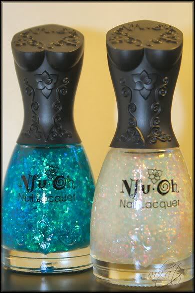
Thankfully, the mailman was on my side and he dropped off these two "icy" numbers to brighten my day!


Nfu-Oh 54 & Nfu-Oh 38

These are my first flakie polishes ever (and my first Nfu-Ohs)....and I just can't wait to dive into them!  Now to learn to take better pictures of my nails...!

As promised, here are a couple of pictures from my trip.  If you guys are bored by these, let me know.  Til then...Happy polishing!

And don't forget about our banner contest. We've got a ton of awesome prizes to give away! 

-mKat

What I'm waiting on: 8 new Konad plates from OCNailart. :)


read more "Brrrrr!"

Get Naked!

Hey guys!

This is an odd post in that it's written primarily for an audience that is new to nails/nail blogs. Many of you who have been doing  your nails longer than I have are probably aware of everything I will write below but for those of you who are just getting into your nails, this entry will hopefully be of some help!

This was partially inspired by D:)'s experiment and partially inspired by my own laziness/lack of time. I often go without polish on my nails because I like nail art and, depending on what it is, this can consume a lot of time. I also abhor things not matching; bare nails match any outfit. :P  (This may also explain why I love French manicures.)

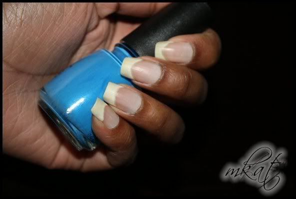
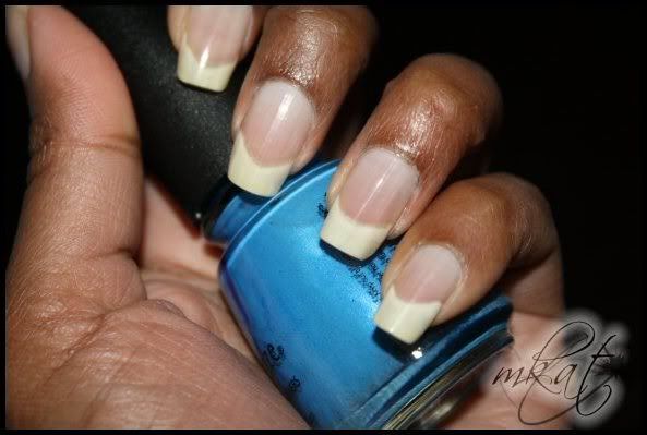
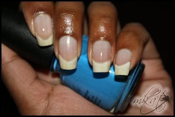
Anyway, I'm here to extol the virtues of a good buffing block. When you're leaving your nails bare (whether that's so they'll have an opportunity to get strong again after continuous polish wear or because you're trying to get rid of yellowing) many of us hate to go without a topcoat. A good buffing block helps solve this problem by buffing your nails to a healthy shine. Often I just file, buff and go. This usually keeps my nails looking healthy (and as though I'm wearing topcoat) for at least 2 weeks.  It also helps polish adhere smoothly the nail bed. The buffing block I'm currently using was picked up from Transdesign.com for less than $2.00.  (Good doesn't have to mean expensive!)

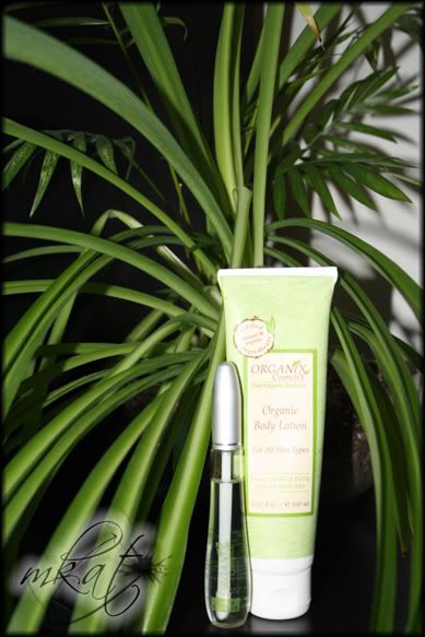
In case anyone is wondering about my cuticles, I will admit that I rarely do much to them.  Sometimes when I'm in the shower and my cuticles are soft I'll use the edge of one nail to push them back.  That's about it. Lazy, lazy!  I have never trimmed my cuticles but I do try to massage them whenever I put lotion on my hands.  (Handy tip...keep lotion next to the sink and make it a part of your hand-washing routine.)  I picked up an Organix Cosmetix manicure set (including hand cream, cuticle oil, a buffer and nail file) for about $35 CDN sometime last year. It works well but there are cheaper solutions (especially for the file and buffer which sells individually for $20!) Love the cream and cuticle oil though.

Note: all photos were taken shortly after my trip. I haven't filed my nails in about 3 weeks.


bare tips


buffed with a 3-sided buffer


 buffed with cuticle oil (Organix)


Organix body lotion/hand cream and cuticle oil


- mKat
read more "Get Naked!"

Essie Art of Spring Collection

I got the new Essie Spring 2010 collection two days ago from Essie's PR rep and since I was too tired to bother with research stuff, I decided to do some swatching by my lightbox instead. I know everyone is going to say, "Huh, pinks and... more pinks. That's Essie alright." And when I first saw the polishes, I kind of thought that too. (Also, more pastel cremes? Definitely feeling a bit pastel creme'd out already and we're not even in Spring yet.) But I actually ended up liking several of the colors. I'll start with the one I liked the least though, just to get it out of the way:

Essie Pop Art Pink
A sheer cool pink. This is three coats. It's not supposed to be opaque and I don't think I could easily get it to opaque. It went on slightly streaky. The name of this one actually really annoys me. When I think pop art, I think bold, aggressive colors; something that makes a statement and is eye-catching. Something like this:

Roy Lichtenstein, Reverie (1965)

Essie Lilacism

This one I really loved: it's the a perfect lilac creme. Two coats and beautiful. It actually provides a strong contrast with my skin. Who knows which art movement this is named after. It seems that most of them had the suffix -ism at the end of their name. Based on the syllables, I'd say Dadaism. And just because I can, my favorite Man Ray photo:

Man Ray, Tears (1930)

Essie Van D'Go

I hear this is supposed to be like MAC Seasonal Peach. If so, then I'm glad I didn't pay through the nose on eBay for it because this shade of peach does not look good on my skin at all IRL. It's a really smooth polish though, three coats is shown above. This name makes me crazy though. Wouldn't it have been much better as an indigo if it's going to be called Van D'Go? (Essie makes some great blues. Why not more??) Like the color of the mountains in this:

Vincent Van Gogh, The Starry Night (1889)

Essie Tart Deco

Again, a really great polish: nicely pigmented, easily applied in two coats. A beautiful, glossy guava creme. But makes my hands seem dirty IRL. :( And what's with the name? Wasn't Art Deco about modern, geometric shapes? Things like machines? (Granted, a metallic Essie in this collection would've just looked bizarre.) I think metals when I think Art Deco, mostly because I think of:

William Van Alen, the Chrysler Building (1930)

Essie Neo Whimsical

A cool pink creme that leans just a bit lavender. This one was very thin and sheer and required four coats to become opaque. But the polish was easy to work and four coats didn't take that much effort at all. I don't actually know how I feel about this color: I really go back and forth between liking it a lot and thinking it a bore. And since I've put up some other picture for every other shade so far, a painting in the Neoclassical style (I mostly just love her pose):

Jean Auguste Dominique Ingres, Comtesse d'Haussonville (1845)

Essie Red Nouveau


A basic scarlet red creme (leans orange). Possibly a tad jelly? This one was surprisingly thin and sheer (and not as glossy as I would've hoped). It took me four coats to reach this opacity; you can get away with three but I wanted to see how long it'd take me to get rid of VNL. As with the other polishes, application was easy... but still, four coats does start to feel like a lot for a red. And one last art reference, from Art Nouveau:

Alphonse Mucha, Spring (1896)

My verdict: I really like this collection in spite of myself. It's so... girly. And Essie. And it mostly looks like pink. But they feel strangely adaptable: as pastel cremes, they are demure enough for staid environments. Yet they are also bright and bold: very loudly and proudly feminine. Overall, the quality of the polishes was wonderful. And for all the grief I gave the collection for their seemingly misfit names, a rose by any other name...
read more "Essie Art of Spring Collection"

Wednesday, January 27, 2010

In the interest of ruining fewer manis...

I don't know about the rest of you but I have to wash my hair nearly every day or else it starts to feel gross. I'm one of those people who scratches their scalp when they wash their hair; I know, it's so bad for the scalp. And, as it turns out, it's horrible for my nails: there's no better way for me to get tipwear than to wash my hair within six hours of putting on a manicure. Which is why I am loving me some of these thingamajiggies: Marvy Scalp Invigorator/Shampoo Brush.

(Picture ruthlessly stolen from some haircare website.)

Kinda scary lookin', eh? It's made out of soft vinyl and is the size of my palm. I pour some shampoo on my wet hair and basically comb this through my hair. It feels nice, lathers up the shampoo really well and protects my manis from hair-washing-induced tipwear. As far as I can tell, it sells for a couple of bucks online. (It wasn't my idea to buy it at all. My SO actually brought this home. He found it at his parents' house -- his mother picked it up in Las Vegas, I think -- and because his mom didn't like it, he thought we might get some use out of it. And he was right!)

I am exhausted right now. I've just spent the last four hours combing the internet for recent research articles on theory of mind in adults. I don't think it got me anywhere. The search for a new research topic continues.
read more "In the interest of ruining fewer manis..."

iNOTD: Milani Cyberspace

Ugh, hugely long day today. All I want to do is go back to bed. At least my NOTD rocks.

Milani Cyberspace


I hope to have time to swatch all the Milani 3Ds I got this weekend. But so far, even though these are gorgeous, I was a little miffed at having to go to four coats to get opaque. And then the very long drying time with Diamont.
read more "iNOTD: Milani Cyberspace"