Tuesday, August 30, 2011

illamasqua Shrapnel


Illamasqua shrapnel, one of the colours from the design competition from last winter. This is easily my favourite of the bunch. It's a metallic pink-copper (flinty, you'll love this) with tiny silver microshimmer flecks. It's a very cool toned metallic and definitely unique amongst my collection. It's opaque in one coat, but I refuse to do one coat (what if I come under REALLY BRIGHT LIGHT and I can see VNL if I look very closely?!) so this is two.


The colour is described as 'the colour of a new penny'. Just to be really pedantic I decided to test this claim - think of this as the nail polish Mythbusters. So, 2010 English penny in hand, I can confirm that...it's not the same colour. It's considerably pinker. Still really pretty, though!


read more "illamasqua Shrapnel"

Monday, August 29, 2011

Hellpolish - Essie Barbuda Banana

I don't have many HTF (hard-to-find) polishes in my stash. This one was fairly recently acquired, and I was so excited! I've always wanted a soft yellow, and you know how much I love Essie...so I thought this would be perfect!


Alas...


Looks nice, eh? Lies!! It's a beast!! This is by far the rougest time I've ever had with a polish. I struggled. It was epic. It manages to be runny and streaky, but chalky. Thick and gloopy, but no pigment. Hellpolish. I suppose it is the nature of yellows though right? Even though I had to battle with it, I am still debating keeping it - Essies are so special to me, and I adore the colour so so much. Rumour has it that Essie is coming out with some easter-egg brights for next spring - perhaps my perfect yellow will be in that bunch?


Have you had any experience with pale yellows - good or bad?


kittytokaren
read more "Hellpolish - Essie Barbuda Banana"

Sunday, August 28, 2011

Chanel Peridot

My new academic year's resolution -- besides to finish my qualifying exams at the end of the Winter 2012 quarter -- is to be more consistent about posting here!


Chanel Peridot


Got lots of compliments on this one. It felt more like a foil to me than a duochrome and oddly enough, the duochrome is more pronounced in the photos than in real life. Still, it was sparkly and bright. A little streaky on the application and you can see some evidence of brushstrokes. Three coats, thinner than I expected though. The photo was taken on the fourth day of wear and, as you can see, it was still chip-free!


Close-up on Peridot
So bright, it burns. :)


I've been up to quite a bit lately. Attended a wedding in Seattle. Saw friends that I haven't seen in a long time (all of whom seem to be in wedding planning mode... so there was a lot of conversation about cakes and caterers, dresses and... more dresses). There are a lot of pregnant women in my life so I'm making quilts, burp cloths and other basic, easy-to-sew baby items. I have also started making quilts for Quilts for Kids, an organization that provides handmade quilts for children in hospitals. I don't get that much time for hobbies and volunteer work, so it's gratifying to be able to kill two birds with one stone on that one. Attempting to make a dress from a 1952 pattern... I suck at sewing darts but now I'm super picky about buying clothes because I'm so aware of how they're made and how they fit. I tried to herd my RAs and got a bit of participant running done in the last two weeks of the summer quarter. I'm doing a little bit of freelance editing for an academic in another country who needs a little help with English and English-language publishing. My own paper just got slung back to me for a second revise/resubmit and I'm writing this post while trying to force myself to read all the comments VERY VERY CAREFULLY so I can see exactly how dumb I am. (Seriously, I can't type numbers. It's a very bad thing to be bad at as a researcher!) I went to the dentist for the first time in three years: I needed two appointments to properly clean my teeth (ugh) and I found out that my previous dentist did a crappy job applying two of my crowns, and thus they need to be replaced (double ugh). Lots of dentist visits. Though I like this dentist and his office a lot: they're the most cheerful bunch of people and all patients get a flower at the end of their appointments. I'm getting LASIK in about a month, so there's been a lot of back and forth to ophthalmologists (and one day I'll spell that correctly on the first try -- I forgot the first 'l' again... at least I got all the 'h's this time). I can't wear glasses because all the glasses I've ever had have given me a splitting headache and my eyes seem to have developed an allergic reaction to all sorts of contact lenses in the past year. It's a sh*tload of money but I'm hopeful that it'll be a good investment. And I'm slogging through a huge backlog of NOTD photos and trying to get some of the summer and fall collections swatched. So I've been busy... and spending more money on fabric than polish lately. A history of cosmetics obsession translates really well to sewing and fabric choices.


read more "Chanel Peridot"

Saturday, August 27, 2011

Urban Outfitters Barstool


(3 coats)

SWEET LORD ALMIGHTY this rocks my world. This may not be your taste but it is EXACTLY mine.
  1. Jelly
  2. Light color
  3. Murky
  4. Flattering
  5. Blue
YUUUUUUSSSSSSS. This color reminds me of photos of blue glaciers sitting in ice-y water.
read more "Urban Outfitters Barstool"

Friday, August 26, 2011

MAC Dry Martini


Oh, Dry Martini...I wanted to love you. So badly. But three streaky coats later (with evident bald spots), and the beautiful olive green tone of the bottle replaced by duck poo brown on the nail...I don't love you. At all. I've seen this colour look amazing on other people but on my skin all the green just flew right out of it.

I also have issues with MAC's formula - this chipped after two days and could really have done with a fourth coat if I wanted it to be totally even. It's a shame, because I LOVE the MAC brush. It fits my nails perfectly. But the polishes usually wind up being a let down for me.

Are there any brands that just don't work for you?
read more "MAC Dry Martini"

Thursday, August 25, 2011

Trying New Things - Orly Pure Porcelain

I've been feeling more adventurous lately - maybe not with colour, but with brands! I recently tried a SpaRitual (long story - you will see it soon!) and loved it. This inspired me to finally break my 'brand rule' and order a polish I have really really wanted for a long time from Orly - Pure Porcelain! (SpaRitual and Orly happen to be sister companies as well, which is neat.)


You're seeing my new, more oval, shape here again! This polish is amazing. It pulls more pink on me than it does on other people, but I just love love love love love love it! The formula is fantastic - not difficult to apply like other pale colours. It's a beautiful combination of white, pink, creme and grey. (Trust me, it looks more dusty when I compare it to my other pale pinks.) One of those perfect "any occasion" polishes and the wear was amazing!! Minimal tip wear and no chips for 5 days! I switched polish after that so no telling how long it would go...


I will *definitely* be trying more from Orly. I'm a huge fan so far! I just wish the bottle was prettier. Oh well, it is very functional.


Any Orly recommendations for me? What are your favourites?


kittytokaren
read more "Trying New Things - Orly Pure Porcelain"

Monday, August 22, 2011

Dior Timeless Gold & Pure Diamonds

Timeless Gold


(2 coats)

An extremely cool gold (though the camera makes it more silver-y pewter than it is). Really like it. But it makes me sad because Dior messed with perfection with their new paddle (Sally Hansen mop-style) brushes.

Pure Diamonds

(2 coats - ignore the ding, hasty swatching)

This one has their old brush. It was so perfect. It was like the OPI pro-wide except a little shorter and the bristles seem to be a bit finer. Application is SO nice with this brush. WHY did they have to take it away? :'''''(

This one is going in the swap pile. I don't do layering polishes. For me, adding a shimmery layer to a creme is like Dior switching to the paddle-mop from the old one. Ruining things.
read more "Dior Timeless Gold & Pure Diamonds"

Sunday, August 21, 2011

New Shape, "New" French

Very rarely do I change up my nail shape. I'd venture to say never. They pretty much grow "squoval" (except my index fingers...those little rule breakers) and I've stuck with that.


BUT. I got super inspired after seeing this video of Sophy Robson doing Lisa Eldridge's nails - HERE. (P.S. I totally want to be Lisa Eldridge.)


A couple glasses of wine, and I was left with this:


It's a sketchy night shot, but I liked it because it shows the navy tips off better than my day shots do. I used Essie T-Bills Putty for the nude and Essie Midnight Cami for my tips.


Result? I am looovvviiinnngggg not only this manicure, but this nail shape. I can even see myself doing this French again with different colours - Maybe a more pinky base with grey tips? I probably will not stick with the oval shape forever - it will be hard to keep up because my natural nail shape will be fighting me, but I will enjoy it! (You will see the Return of the Squoval soon here on PoP - I have several swatches that I photographed a little while back still waiting to be shared.)


So - I'm nervous to ask - but what do you think?? Do you prefer the oval or the squoval on me? Do you ever switch up your nail shape? Let me know, I'm curious!!


kittytokaren
read more "New Shape, "New" French"

Friday, August 19, 2011

H&M Blue My Mind


Oh neon blue, my old nemesis. My favourite colour to wear and my least favourite to photograph. This one's worth the effort, though:


Two coats. I've used a topcoat but the polish (surprisingly for a semi-neon) dries glossy in any case. It pools a little at the cuticles because it's a thick creme but the brush makes it very easy to control, I had barely any clean up. H&M polishes are only £2.99 and while the quality isn't the best I've tried (I tend to get wear after 2-3 days), for the price they're pretty unbeatable.


And the colour? Drooooool. Very very bright mid-blue with a hint of violet. It's really gloriously loud and opaque.


(If any of you are into mosaic, there's a bright blue smalti tile that matches this colour. It was my favourite when I was a kid, I used to use it in every craft project going. So I'm pleased to be able to wear that colour on my nails!)
read more "H&M Blue My Mind"

Thursday, August 18, 2011

Dior Czarina Gold


(2 coats)

This is like China Glaze's Ingrid pumped up (and darker, which works better with mah skin). Love it.
read more "Dior Czarina Gold"

Wednesday, August 17, 2011

OPI Fall 2011: Touring America - I got a little crazy.

I initially only ordered a couple of polishes from the OPI Touring America collection - and then I saw them in Ulta and picked up a bunch more. I honestly wish I had restrained myself a little more, but at least I can share them with you now! I really wanted to show you the colours as they appear in real life (not lit up by some super bright lamps) so as a consequence some of these come off really dark - which they do in reality!


Uh Oh, Roll Down the Window


I'm really excited to wear this one this fall! My first ever olive green. Super creamy. I think it's one of those ugly-pretty colours and will look really nice with navy!


I Brake For Manicures


This was a lot browner on the nail than I expected - it looks more purple-y in the bottle. Part of me wishes this wasn't so dark because that would let the colour really shine.


Get in the Expresso Lane


I'm not usually the biggest fan of brown nail polish. I like it in swatches, but I never seem to feel excited about wearing it. This changes my mind - it's grey-er and greener than typical chocolate browns - and I like it! I think the camouflage-style undertones give brown a much-needed update.


French Quarter For Your Thoughts


A very welcome addition to my grey collection - lighter than the other true greys I own, I think it's really flattering on - it has a bit of warmth that keeps it harmonious with my yellow skin. It reminds me of elephants.


Road House Blues


Believe it or not, I don't have a true navy blue creme in my collection. The closest thing I have is OPI Sapphire in the Snow, which is much more purple. Again, I wish this was lighter so the beautiful creamy navy with a *hint* of purple could really take center stage.


A-Taupe the Space Needle


Last (and definitely least) is the one I really regret picking up. This just looks like poo on me. Poo. Sigh.


What do you think of OPI's fall offering? I was excited by the prospect of a bunch of dingy, dirty cremes, but I'm a little let down by how some of them are "almost black". I think most of us are over "almost black". I know I'm sick of hearing people ask me "What colour is that? Black?" That being said, I think several of these will become staples in my collection! I'm so looking forward to fall...


kittytokaren
read more "OPI Fall 2011: Touring America - I got a little crazy."

Tuesday, August 16, 2011

Illamasqua force - a 'WTF?' polish


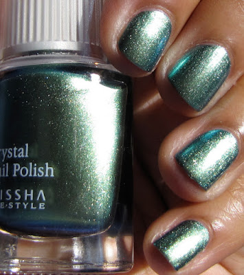
(Ho ho ho, a Star Wars joke, bet you didn't see that coming!)


Since we've had a rare few days of sunshine, and since I now have a car, I took the opportunity to go to some of the National Trust properties nearby. They're basically rural stately homes that are preserved by a charity and they're generally speaking lovely - Packwood House, where we went last week, is a favourite. It's a Tudor manor house, originally erected in 1480, which was much restored in the 1920s and 1930s by a chap called Graham Baron Ash, who was a deeply enthusiastic restorer and spent an enormous amount of money doing up this house and others nearby.


Anyway, I promise I am going somewhere with this tangential history lesson. Aside from the fact that it's an interesting and beautiful place to visit, it also has some lovely interiors and a stunning garden. The colours gave me lots of ideas for manicures I wanted to try (nail varnish being my artistic medium, and all...). This is the first 'NT-inspired' manicure - I wanted to take the colours from the French tiling in the bathroom:


I decided my best bet for a match would probably be Illamasqua Force, a dusky mid blue, with white crackle layered over the top. However, I forgot that Force is an...idiosyncratic polish. Basically, it doesn't behave itself. The Swatchaholic has already commented on how it changes colour with Seche Vite. In my experiments today it behaved even more weirdly. Here it is on its own, with no top coat. This is a very colour accurate shot, IMHO. It has an unusual grey-violet undertone to it that makes it unique amongst my (large) collection of blues.


Fugly pic time! This shot shows what happens when you layer white crackle over the top. You can see a) the bits I didn't clean up (intentionally, to show you - sorry for the fug) where white crackle is not on top of Force, and is white; b) where it went over Force and turned pale blue; and c) how they've both deepened considerably to a royal blue/lavender combo with the addition of top coat (Lumos, since you ask). What a weeeeeeird polish.


Here's some proper pictures:


So that...uh...totally didn't work. The final effect is nothing like the tiles! Just to show that CG white crackle doesn't normally change over blue, here it is over Orly La Playa. (I know, I know, claw-hands and an iphone picture, I'm spoiling you today). Force is...odd.


read more "Illamasqua force - a 'WTF?' polish"

Monday, August 15, 2011

Missha HG R01


(2 coats)


The rose scent on this is so impressively strong. I could smell it days later.
read more "Missha HG R01"

Saturday, August 13, 2011

Pinky Perplexity - Essie Lion Around

Remember how I went on my Hunt for Red (by) October last year? I may have to consider doing the same thing to find my perfect pink - opaque, not too sugary sweet, but not too fleshy either. This came close, but didn't hit the mark...and it's driving me bananas. (B-A-N-A-N-A-S.) I think the winner might have been Chanel Mistral, but I missed out on that one. :(


Essie Lion Around is from this year's Resort collection, and I wasn't planning on picking it up. I was quite happy with my picks - Da Bush and Your Hut or Mine. However, I was in Ulta one night, and through a complicated issue with returns and coupons, it somehow managed to work out such that they paid me to take it out of the store...yeah...I'm still looking over the receipts on this one. It was the one polish that spoke to me in that 15 seconds I had to decide!


I actually expected to hate the finish of this polish...and I do. But not as much as I thought I would. It isn't apparent in my photo, but there is subtle pearly shimmer in the polish, giving it a satin appearance on the nail. I don't know why, but somehow the combo of that finish and this particular colour makes me feel queasy - like when I think of pork that is a few days expired. The effect isn't as strong as I anticipated though, so that's good.


What I was genuinely surprised by was the colour - it was much peachier on me than I expected! I'm not sure why I thought it would be cooler-toned. I normally like a little peachiness in my pinks - it keeps them from being overly saccharine - but the orange-y yellow tones in this are a little strong and kind of...blends...with my yellow-toned skin a little too well.


In the end I don't totally hate this polish - I appreciate it not as my perfect pink, just for what it is. I like that it's a pink that isn't 4-year-old-with-a-My-Little-Pony pink. (Although MLP is pretty kickass. I had one when I was a kid. I called it "Balls". I kid you not. How my parents kept a straight face I will never know.) However, I don't think I'll be keeping it. I'm trying not to keep polishes I'm not excited to wear!


Any suggestions for my perfect pink? Would you like to see a pink "Hunt"?


kittytokaren
read more "Pinky Perplexity - Essie Lion Around"

Thursday, August 11, 2011

Holy magenta! Illamasqua obsess


I'm totally going back on my adult aversion to pink, because this is a knock out. It's a good job this polish didn't exist when I was 15 because I had my hair the same colour and would have drained bottle after pricey bottle.


Three coats of opaque, neon blue-pink fabulousness. It's much more purple than barbie pink - more magenta - but it's very bright. I'm guessing it would glow under UV. The neon pigments mean it dries a bit satiny so I have a coat of lumos over the top. Winner in my book.

read more "Holy magenta! Illamasqua obsess"

Wednesday, August 10, 2011

Lippmann Funky Chunky


(2 coats)


So... I don't hate this. It reminds me of an 80s purse in black patent faux-snakeskin (with a chain armstrap!). I've never hated this. I've worn it a few times, in fact.

This is a trick to apply and to dry: The glitter sinks so you have to shake it like a polaroid picture in between coats and then you have to sit and let it dry because a top coat would ruin the finish. The whole situation is not ideal. But it's so weird, different, and hated that I have to like it...like an underdog.
read more "Lippmann Funky Chunky"