Showing posts with label MeganChair. Show all posts

Monday, November 15, 2010

Purple Jelly Comparison

Hi guys!  I have a small comparison for you today.  A reader asked how these two polishes compare when I posted my swatch picture of Deborah Lippmann Call Me Irresponsible so I figured I do a formal comparison.  I don't have a bottle comparison picture since the Milani is in an opaque bottle.  First up, I'll repost the swatch pictures of each.

I think this is four coats of Milani Rad Purple.


And here's a picture of four coats of Deborah Lippmann Call Me Irresponsible.


Now on to the comparison.  I've got Call Me Irresponsible on my index and ring nails.   Rad Purple is on my middle and pinkie finger nails.  I used four coats of each and this picture was taken in the sun.


This picture was taken inside by a window.  This one is the most color accurate of all my photos.  I think it's funny how the Deborah Lippmann comes closer to the Milani bottle than the Milani does.


And this picture was taken with the flash.  It's not very color accurate, but that's how it sometimes goes with purples.


Rad Purple is brighter and redder than Call Me Irresponsible (which is bluer). Rad Purple also dries to a satin finish so I put top coat on it. Call Me Irresponsible dries shiny.  Formula-wise, the Milani behaved better for me.  I had a heck of a time trying to get the Deborah Lippmann even, but the Milani wasn't so bad.  They are both jelly finishes.

It seemed like such a shame to just wipe these off after taking pictures so I tried out some layering.  I pulled out Pure Ice Heart Breaker and Nfu-Oh #51 and added on coat of Heart Breaker to my index and middle nails.  Then I put one coat of the Nfu-Oh on my ring and pinkie fingers.  Gah!  This was so gorgeous.  I'll have to do a full manicure of Call Me Irresponsible with the Nfu-Oh on top very soon.


I hope you enjoyed!
read more "Purple Jelly Comparison"

Wednesday, November 10, 2010

I Love Accent Nails!

I love doing accent nails.  It's actually my favorite way to wear those super glittery polishes that are a huge pain in the butt to remove (even with the foil method).  I love wearing a plain creme or jelly polish as my main color and then a coordinating glitter bomb on my ring finger or thumb.  This is super easy since you don't have to be very creative to do it.

Here's a recent accent manicure I did with Orly Orange Punch and OPI Extra-Va-Vaganza ring fingers.  I used four coats of the Orly and three of the OPI.


I got a close-up picture of the glittery ring finger for you.

 
Another recent accent manicure I liked consisted ofOPI Lincoln Park After Dark with OPI Mad As a Hatter thumbs.  I went with three coats of each for this one.


I even went with an accent nail manicure for Christmas last year.  I loved this one.  I went with (I think?) three coats of BB Couture Fairy Blood for the red and three coats of China Glaze Emerald Sparkle for the green.


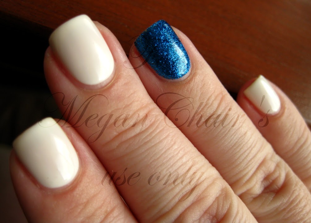
This was one of my favorite accent manicures.  I went with four coats of Essie Marshmallow and four coats of Pure Ice Strapless.


Another favorite of mine is Essie Licorice with OPI Mad As a Hatter ring fingers.  I went with three coats of the Essie and four of the OPI.


Another one I did around the same time is OPI A Grape Fit! and Mad As a Hatter.  I did three coats of each.


I also love this combination and I've done it several times since.  This is three coats of OPI Dating a Royal with four coats of OPI Absolutely Alice.


And last, but not least, is a manicure I did with three (maybe four) coats of OPI Do You Lilac It? and Mad As a Hatter.


I know accent nails are everybody's cup of tea, but they sure are mine!
read more "I Love Accent Nails!"

Saturday, October 30, 2010

Dare To Wear Back To Basics Collection

So I ordered this collection of polishes after seeing Lextard's swatches on her blog.  Seriously, when I need lemmings, I just check out her blog.  I have a nail crush on her.  I got these from Ebay for around $30 (USD) after shipping.  Not a bad deal, I think.  I really like all of them except I had some trouble with the white one, which I'll explain later.  For now, here are my swatches!

First up, this is True Red.  Seriously, this one's a perfect cherry red creme.  I used two coats for this swatch, but I could have gotten away with one if I'd been a little more careful.


This is Yellow Twist.  I don't usually wear yellow polish, but I do know about how difficult they normally are.  This yellow isn't difficult to work with at all.  I only needed two coats and I will definitely use this one as my perfect rainbow yellow from now on.  Great formula.


Enchanted Forest is a deep, mossy green.  I was under the impression that this was a jelly and I have no idea where I picked that up.  I might be confusing it with Nars Zulu.  This is definitely a very pigmented creme and I only needed two coats for this swatch.  Still, it's a great color and I'm glad I have this set.


Ocean View is a medium blue creme.  It's super pigmented as well and I only needed two coats.  It's been a while since I swatched these, but I wrote "perfect" in my notes when I swatched this one.  It's seriously perfect.


Powerful Black.  I needed two coats here, but the formula is super creamy and pigmented.  When I reach for a black creme for layering, I usually go with Wet 'n' Wild Black Creme, but I just might reach for this one next time.  Sure, I needed one more coat, but it's super glossy and nearly perfect to work with.  Very nice, indeed.


And lastly, this is Rue St. Vincent.  Unfortunately, I think my bottle sucks.  The formula is chunky and watery at the same time.  I carefully applied three coats for this swatch, but I would definitely not wear this one as a manicure when there are much nicer white polishes out there (Sally Hansen White On, for instance).  I swatched this one first and was a bit disappointed so I'm glad the rest made me change my mind.  Since this was the only one with a horrible formula, I'm thinking that it's just a fluke.


Overall, I really like these.  The kit came with a clear top coat as well.  I'm pretty sure it's not fast drying, but I'm going to try it out with Seche Vite to see if that'll stop the shrinkage I get with Seche Vite.  All these swatches are without top coat (most of mine are) and you can see how glossy they are.  I am very glad I ordered these.

UPDATE:  I tried the Dare To Wear top coat underneath Seche Vite and it ended up wrinkling.  :o(
read more "Dare To Wear Back To Basics Collection"

Wednesday, October 27, 2010

A Grey Comparison

It's comparison time again!  This time I thought I'd compare some of my grey polishes.  Here's the cast of characters:


I applied three coats of each in the same order as above, from thumb to pinkie.  I took this picture in the sun.


I took this picture in the shade.


And I took this picture with the flash.


I was hoping to find a dupe for Waking Up In Vegas, but I didn't.  What I actually found was that it's probably my least favorite of these polishes.  It just seems to not go as well with my skin tone, unfortunately.  Oh well, I still needed to have it for the name.  It seems like a lighter version of Recycle, but I prefer Recycle with my skin tone.

High Society and Vintage Gray are very similar in color, but Vintage Gray is lighter.  There's probably no reason to own both since they're quite similar, though if you like this type of color, then owning both might be a good thing for you since they aren't dupes.

Point Break and Recycle are the darkest greys in this comparison.  Point Break leans blue whereas Recycle seems to lean a bit green.
read more "A Grey Comparison"

Friday, October 22, 2010

Some OPI Designer Series Swatches

I have to admit that the Designer Series polishes are my favorite holographic polishes.  They aren't quite as holographic as the Nfu-Oh holographic polishes, but they apply a whole lot better.  In fact, they apply just like regular polishes.  None of that crappy, streaky, draggy formula where you have to be careful to let the previous layer dry completely before moving on.  Nope.  The Designer Series polishes are fantastic.  You don't even need a special base coat to make these work.

First up, this is Original, a light purple.  The holographic effect on this polish is top notch and one thing I like about this color is that it's still gorgeous in the shade.  Of course, the holographic effect goes away in the shade, but it's beautiful either way.  I used three coats for this swatch.


I decided to take some pictures of these at a different angle to really show off the rainbow effect.


This is Shimmer.  Shimmer is a silver holographic polish that really should be saved for top coat use only.  It's very sheer and I needed four coats for this swatch.  I don't want to waste it so this is probably the only time I'll use it alone.  Still, this one is very holographic and just gorgeous in the sun.


This is Signature, a cool pink holographic polish.  I don't usually go for pink polishes, but this one is really pretty and I could picture myself wearing this one and loving it.  Hey, add holographic particles to most anything and it makes it better, right?  I used three coats of Signature for this swatch.


I saved my favorite for last.  This is Desire, a tan holographic polish.  I love, love, love this polish.  It's holographic and it's neutral enough to wear to work, in my opinion.  Although, I do work with a guy with a bright red mohawk so that just shows off our lack of a dress code.  I could get away with just about any polish for work so this is seriously tame.  I really wish I had more holographic neutrals.  I used three coats of Desire.


That's it for the rest of my holographic Designer Series polishes.  I hope you enjoyed the pictures as much as I enjoyed swatching these beauties.
read more "Some OPI Designer Series Swatches"

Monday, October 18, 2010

OPI Here Today...Aragon Tomorrow Suede and a Comparison

I love matte polishes and the OPI Suedes are no exception.  So when I found out that OPI was releasing a suede version of Here Today...Aragon Tomorrow, I knew I had to have it.

I went with two coats of it over a completely dry base coat for this swatch.


 And because I was curious, I topped it with a thick coat of Seche Vite for these two pictures.


With top coat, this one's super sparkly in the sun.


Since I love to do comparisons, I got out my bottle of Zoya Verushka.  From left to right, this is two coats of the OPI with top coat, two coats of Verushka with top coat, two coats of the OPI, and two coats of Verushka.  I took this picture in the shade.


I took this picture in the sun.


And I took this picture with the flash.


While matte, these polishes are really close.  Verushka is a little darker and bluer than the OPI.  The differences really come out with top coat.  With top coat, Verushka really outshines the OPI, in my opinion.  It's more sparkly and seems to have a depth to it whereas the OPI seems flat.  Don't get me wrong - I like both polishes, but I like the Zoya a whole lot more.
read more "OPI Here Today...Aragon Tomorrow Suede and a Comparison"

Thursday, October 14, 2010

An Avocado Green Comparison

Time for another comparison!  The other day was partly cloudy (yet still as hot as a furnace outside!) so I did a few comparisons.  They are good for partly cloudy days since I can go inside and type up my thoughts while I'm waiting for the sun to come back out for my sunny picture.  You should see me.  I jump up in the middle of typing to run outside and catch the sun.  It's pure comedy, especially if I forget to put on my shoes and I have to hop around on one foot trying not to burn my soles.  And if one of the cats accidentally gets outside?  Knee-slappin' fun.

I don't have a lot of avocado greens, but I compared all three of them for you.  Here's the cast of characters.


 I applied three coats of each, in the same order as above, from left to right.  I took this picture in the sun.


I took this picture in the shade.


And I took this picture with the flash.


The Nubar is the lightest of these three.  It's also got the least amount of yellow in it.  The formula is fantastic and if I'd been more careful, I could have gotten away with only two coats.  It's the most pigmented of these three polishes.

The OPI and the Nina are pretty darn close.  The OPI is slightly darker than the Nina, but I think they are so close that you wouldn't need both.  The formula on these two is very similar as well.  Both polishes are a bit streaky and watery, but look great with three coats.

I hope you enjoyed!  :o)
read more "An Avocado Green Comparison"