Showing posts with label Coral. Show all posts

Tuesday, August 2, 2011

My lame nail art.

For some reason, I had the urge to engage in some nail art recently. Little nail art. Nail art is usually way, way, way out of my comfort zone, but I felt a burst of creativity! My mani at the time was Essie Geranium (which is actually much more orange-toned that this pic would suggest). I added three little dots of Essie Turquoise & Caicos on each thumb using a bobby pin.

Essie Geranium + Turquoise & Caicos


I thought the result was fairly cute and went well with my turquoise jewelry!

And yes, I took this picture in my car...I wasn't going to share it at first but then I felt like snapping a pic at the wheel. However, I was parked in a parking lot! Don't ogle your nails and drive ladies!

Please don't judge too harshly - nail art is not my thing! Have you tried any nail art lately?

kittytokaren
read more "My lame nail art."

Friday, July 29, 2011

My Top 5 Summer Pedicures (2011 edition)

I started a tradition last year of sharing with you my favourite pedicure colours of the summer...without showing you my feet of course! (See Piff's picks from last summer here as well!) In observation of this tradition, here are the top 5 pedicure colours that I've been loving and wearing this summer!


Thumb to pinky:


Last winter, I almost always had a gold glitter pedi on my feet. Something about taking my socks and boots over and seeing gold glimmering back at me made me happy. I decided to try it out in summer and well, and my fav gold glitter for the warmer months has been Gift of Gold - for two major reasons. (1) It has fine, fine glitter, which I think looks really great and makes for easier removal, and (2) the tone of the overall polish is much warmer than the other golds I own, which I find very summery.


A classic OPI, sent to me by the very sweet and amazing ilexica! This is just a punch of colour for the toes that I can't get enough of...and it seems to go with everything.


Before I broke up with RBL, Purple Haze was one of my favourite pedi colours. While DOiD is definitely not a Purple Haze dupe, the idea remains the same. A pastel-ish, but saturated purple on the toes looks great with metallic sandals, but remains feminine and summery without being in-your-face. I might like this better on toes than on tips!

Essie Watermelon

Exactly the colour you think of when you think of watermelon. Such a fun summer colour for tips or toes! It's a perfect hot pink that leans red instead of blue (like Bachelorette Bash), and it's just...cute!


One of my all-time favourite pedi shades, and it is actually my current pedicure. Yes, dark is maybe not the way many ladies want to go in summer, but I think it's a really elegant counterpoint to the lighter fabrics and colours women are wearing. It seems to coordinate well with many other polish colours for tips, and the shine is amazing. I adore this.


What are your fav pedi shades for this summer?

kittytokaren
read more "My Top 5 Summer Pedicures (2011 edition)"

Monday, June 13, 2011

More Bright! - OPI Cajun Shrimp

I think that this might be a Polish or Perish favorite! My bottle of OPI Cajun Shrimp was sent to me by the fabulous ilexica, who already had a bottle herself. It is also one of Piff's summer faves. And now, it has a permanent place in my stash!

It's not coming out as shocking in the picture as it is on me in person, but it is a hot-hot-hot pinky coral!


While I prefer Essie Geranium on my tips, I think that this will be a favourite pedicure shade of mine this summer! In fact, I think I'll put it on tonight...

Is there a shade that is universally loved among your friends?

kittytokaren
read more "More Bright! - OPI Cajun Shrimp"

Friday, June 10, 2011

Nfu Oh Jellies

Here are the other three Nfu Oh jellies I bought.

JS 09


(2 coats)

Color me pleased! Imagine my glee, 2 coats and I'm satisfied with the coverage. What is a pretty pink-leaning coral in the bottle really just pulls pink against my skin but I'm still ok. This one's a keeper!

JS 42


(5 coats)

I had to seriously mess with the photoshop in order to get this one even close to the reality. It is a red leaning brown, not a brown leaning red.

Given that I needed 5 coats to get it to acceptable coverage, I am shocked by how well this dried and without bubbles at that!

JS 04


(4 coats)

People on MUA have responded pretty well to swatches of this one but make no mistake, the formula on this one is a hot mess. Verrrrry gluey and does not level at all.
read more "Nfu Oh Jellies"

Tuesday, May 17, 2011

Illamasqua Purity

I checked out the Toxic Nature collection and really wasn't that wowed. However, Illamasqua had a 20% off sale, and there is nothing like a sale to persuade me I want something. I do like the fact that Illamasqua hold such regular customer sales, plus the 10% off I always get for being a repeat customer. Thumbs up there.


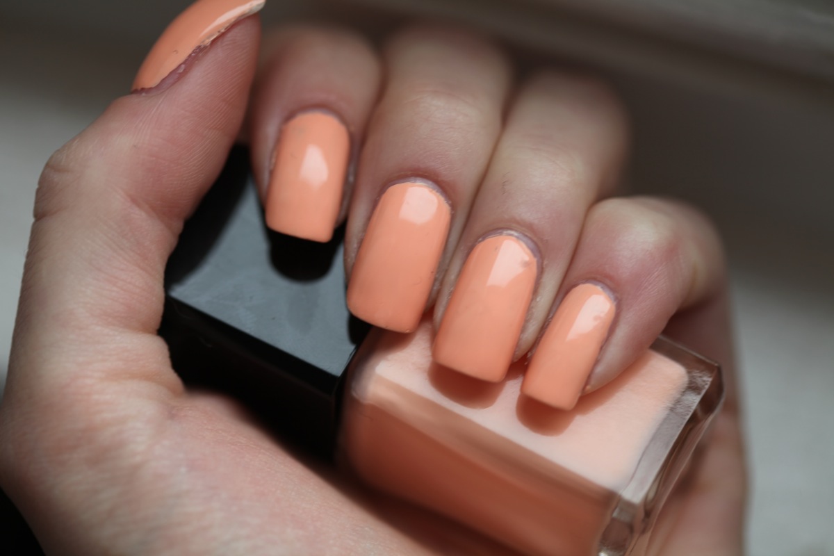
So here is Illamasqua Purity. A fairly standard, pretty, pale peach. The finish is very creamy and the colour is very pretty and fresh and definitely name-appropriate. However, I had issues with application and wear. It is very thick but also a little streaky, so even after two thick coats the coverage was a little sparse in places. (And with this polish, thick coats is all you're gettin', because it's so gloopy). I had major chips by day two, which is very unusual with an Illamasqua polish. I like the colour, but the formula? Not so much.


Any Illamasquas you're keen to see? I have quite a few of them. Also: a hoarding problem. But we won't go there.
read more "Illamasqua Purity"

Sunday, April 24, 2011

Cute Cute Cute! - Essie Chubby Cheeks

Hehe I always giggle when I say the name of this polish! It is so cute! (Kawaiiiiiii!!!) I'm not sure what exactly this coral colour has to do with Chubby Cheeks, but the colour is pretty cute as well!

To add to the cuteness, the colour is really close to the packaging of my eos lip balm in Summerfruit - my favourite flavour of all the eos balms.

Check it out...


The formula on this was great - I believe this is two coats? And I had minimal clean-up to do.

I'm really itching to start wearing my spring/summer colours. I wore this when it was really dreary out to perk myself up, but it seemed a little out of place. I got lots of compliments though!

Have you started wearing spring/summer colours yet?

kittytokaren
read more "Cute Cute Cute! - Essie Chubby Cheeks"

Friday, April 15, 2011

My Top 5 Summer Pedi Colors of 2010

Inspired by K2K's post, I thought I would share with you my own top 5 summer pedi colors of the 2010 summer. I wore all of these at least twice last summer.

I generally get pedis year round, but some colors just feel right when it's hot out (and some feel very wrong, like my fav pedi color - NARS Midnight Express). Here's my summer-time list:

  • American Apparel Malibu Green


(2 coats)

You didn't think I was gonna subject you folks to my feet, did you?

Love this color, but holy crap, I wore it ONCE as a mani and will never do that again. Stain city! Very pigmented formula. Could have gotten away with one thick coat. AA has some incredible polishes.

  • Zoya Charisma (Sinful Dream On, Essie Perky Purple)


(2 coats)

This photo isn't even close to color accurate. I couldn't even fix it w/ photoshop. It's like my computer is telling me this color does not exist and is merely a figment of my imagination.

No matter what, you know what it looks like. You've seen Charisma or one of her cousins. It's a great "staple" neon. I love this color so much.
  • OPI Cajun Shrimp


(2 coats)

Probably my favorite pedi color period. I did a pedi with this 3 times last summer and a couple times as a mani. Considering how many polishes I have...

  • China Glaze Flip Flop Fantasy


(2 coats)

I'm fairly certain it was THE pedi color of the Summer of 2010 among NP enthusiasts.

  • Milani Radiant in Purple


(2 coats)

Really any medium purple creme works in this space. It's a go-to for me.

I wonder what's in store for us this year...
read more "My Top 5 Summer Pedi Colors of 2010"

Friday, July 9, 2010

Oranje Boven!!: Essie Cantaloupe

The little tiny country I call home - The Netherlands - is in the World Cup final!!! I don't know how many of you are following the soccer, but this is a very big deal to me and to everyone back home! I felt like I had to wear something in the orange family to commemorate this and to wish them luck for the match against Spain on Sunday!

I've been lusting after Essie Cantaloupe for a while, tried to swap in vain, and finally pulled the eBay trigger. So glad I did! I've never liked cantaloupe the fruit - I call it 'the icky orange melon' - but I am loving Cantaloupe the polish!


I never thought anything so orange could look this decent on me! I feel like this should be a part of my "Quest for Coral", but what it really is is a soft melon - it is a little bit muted, but bright and punchy enough to stay out of Grandma territory. It's a juicy summer colour and definitely has that zest I've been craving recently. Plus, I got more than a few compliments on it! (Hi Eleanor, if you're reading this!)

I think I've changed my mind on this 'icky orange melon' - it's quite delicious!

Are you supporting your team with a mani right now? Are you cheering for Holland (Yay!) or Spain (Boo!)?

kittytokaren

P.S. Hup Holland Hup!
read more "Oranje Boven!!: Essie Cantaloupe"

Monday, June 14, 2010

Two Dior NOTDs: Sweet Orange and Lemon Balm

Dior polishes are my weakness. I try to get them cheaper but if I can't, I'm perfectly willing to shell out the $20+ for them.

Dior Lemon Balm
This one was just INCREDIBLE luck. I couldn't find it ANYWHERE and then all of a sudden, it shows up on eBay for less than $20 shipped. The first thing I think is that it must be a scam, it's too good a deal but just in case it wasn't... I ordered it. It came and it looks like the real deal! And even if it isn't, it's a great polish. I couldn't capture the subtle multichromicity (not a word) of this polish. In some lights, it looks like a dusty brown infused with bronze shimmer. In other lights, it's a dusty dark purple with gold shimmer. It's a very elegant polish and applies with characteristic ease: thick, pigmented polish that's very easy to control. Two coats.

Dior Sweet Orange

Another eBay deal. I think this was $15? This one was a bit more of a pain to apply. See the dent in the polish? That's because it took longer to dry than expected. I'm very spoiled when it comes to Dior polishes so I was surprised when it hadn't dried by the time I finish applying topcoat. Also, I find some of the lighter Dior colors tend to be a bit on the sheer side. This was four coats, possibly five. I don't like many corals on me but this one I really enjoyed.
read more "Two Dior NOTDs: Sweet Orange and Lemon Balm"

Tuesday, June 8, 2010

My Quest for Coral: Part 2

Alright ladies, here we go! Three corals that I think are the best I've found so far!


OPI Chapel of Love (black label) Revisited:

I've gone back-and-forth on this polish so many times it's hard to count. I've gotten it, swapped it away, swapped again to get it back, etc. This is the last time and I'm keeping it!! (But I'm still undecided about how it looks on my tips! Toes - excellent.) What makes this polish so beautiful is the fine gold shimmer in it - it really warms the colour up and causes it to look quite pink in some lights - almost bubblegum - then very coral in others. The formula on this was...not ideal. If you look closely, you can see that I still have VNL - after 3 coats! Not really liking that aspect.

Essie Carousel Coral:

I really like this one - it's more intense than Chapel of Love, but I think I might still be able to pull it off. I really like that its a creme and doesn't have shimmer - coverage was also really great! I think this might be my favourite one on me...which surprises me. I want to do a full mani with this!

Zoya Cassi:

This is lighter and more subdued than Chapel of Love, with a slightly more orange tint. It also has champagne shimmer instead of gold, which softens the polish and gives it more of a cool cast - which is probably more flattering for my skin. I think this is a winner.


Conclusions? I like all three of these, but I'm still not that comfortable wearing corals! Maybe I'm not a 'coral person'? I typically don't wear such bright colours... I've learned along the way that pink-toned corals suit my skin better than orange or red-toned corals, so I feel like all of these three flatter my skin tone pretty decently. I don't know what my problem is...I need the input and critical eye of the PoP readers to help me out here!

What do you think? Are any of these 'my' coral??

kittytokaren
read more "My Quest for Coral: Part 2"

Tuesday, May 11, 2010

Off the beaten path Neons (Sonic Bloom and Cream Pink)

Sonic Bloom from Sally Hansen

(2 coats)

OK so this one isn't exactly a neon so much as it is very bright and difficult to photograph. LOVE this polish tho, it applied beautifully (almost a 1 coater) and dried shiny and quickly.

Cream Pink from Sinful Colors

(2 coats)

Neon pink (yes it dries kinda matte) with gold shimmer? Yes please!
read more "Off the beaten path Neons (Sonic Bloom and Cream Pink)"

Monday, April 26, 2010

Essie Carousel Coral

This NOTD is for Kittytokaren since she is on her hunt for the perfect coral! I'm not a huge fan of corals, I only maybe have two or three out of the 300 polishes I own. Carousel Coral was actually the first coral I ever bought and ever since then I just didn't see the need for me to own a lot of corals. Sometimes corals can be too pink, or too orange, and in Kittytokaren's case, too bright for her! Carousel coral definitely made my hands look tanner, and it was hard for me to capture on my camera especially without sunlight! It's actually a tad brighter in real life, but not too bright that it hurts your eyes.


Honestly, I almost never wear this.. corals just aren't for me. And on top of that, neither is Essie. I know people love Essies, but for me I can't get them to apply well. Essie is the only brand that I haven't mastered. Almost all Essies take me three coats to get it even and opaque. I'm a two-coater kinda gal, I'm just too lazy to put on a third coat. Then at the end of this mani, I got lint in it.. sad :( That is what you see on my middle finger, those two bumps are LINT. I hate it when that happens!! I just don't have the patience to go back and do the nail again since I had to put three coats of polish on. The only Essie that I never have trouble with is Jelly Apple which is my HG red creme/jelly.

Does anyone else have a brand that they just can't get to work for them?? Any tips for me for using Essie?

read more "Essie Carousel Coral"

Saturday, April 17, 2010

My Quest for Coral: Part 1 of...Many?

I've never been able to find my perfect coral polish. Every summer I give it a haphazard stab and typically end up giving my coral duds away. I think because I am super pale it is hard to pull them off - corals always seem to look better with a tan!

This summer I've decided that I am going in whole-hog on my quest for coral! Here are my first two stabs at it. I like things about each of these colours, but neither of them are my Holy Grail.

Attempt #1:
First up we have Essence What Do U Think? (hate that name...) that I picked up at Ulta for $1:


This is widely known to be a Chanel Orange Fizz dupe. I saw Orange Fizz in person at the Nordstrom counter and thought it might work for me, but this was the easy $1 way to try it! While I like the colour, and would probably really love it on my toes, I think its too bright and sha-POW! on my tips. There is something I find appealing about this colour - I love that it's a creme and there's something downright juicy about the melon hue - but in a lot of lights it looks like neon orange, and that's just not my bag.

That being said, I loved the little Essence bottle - so cute! And the brush was nice and wide and worked great, formula was quite nice as well - for a dollar it was a great purchase. If you're looking for Chanel Orange Fizz, I'd point you to this lovely.

Attempt #2:
Next up in Essie Brandie Alexander. I have been really loving this on my toes for a while now, and it makes me really happy to see it on my piggies, so I thought I'd give it a shot on my tips:


I felt a little uncomfortable with this on my tips - again it just feels like brightness/colour overload for me...I'm just too demure with my nail colours I guess! But I received a *ton* of compliments on this one when I wore it! I might have to take it for another spin when I get a bit of colour on me (which is a long, slow process).

The formula was typical of Essie for me - two easy coats of deliciousness - but then again this is the black label version with all of the lovely chemicals in it. It has a light shimmer to it that isn't all that obvious but adds a depth to the colour. It leans more pink than the Essence, but in other lights it is most certainly coral. I wore it for several days and I have to say the wear was amazing - not a ding or chip in sight!


All in all, I have to say I haven't found my coral for my tips yet. I need something softer, I think. But both of these colours are really pretty and I will really enjoy wearing them on my toes this summer!

What is your perfect summer coral??? I would be very curious to hear any suggestions!

kittytokaren
read more "My Quest for Coral: Part 1 of...Many?"

Sunday, March 14, 2010

Some old Maybelline swatches: Bolt of Blue and Mediterranean Coral

Mmm, dollar store loot!

Maybelline Bolt of Blue


This one I loved in the bottle but not so much on the nail. It's a light blue shimmer that is chock full of blue and silver shimmer. Actually, quite glittery but very gritty in both appearance and texture. (It might be helped by topcoat but this is just a swatch, hence, no topcoat.) Two coats, could've used three.

Maybelline Mediterranean Coral


I actually really love this color in theory: a gorgeous rich coral with gold shimmer. But I don't like it as much on my nail: as much as I enjoy corals and oranges, many of them don't really seem to flatter my skintone. I always feel like my hands look old and grey with these types of colors. Very easy application. Again, two coats, could've used three...

I wish there were all sorts of awesome dollar stores around me that were easily accessible by me (i.e. without a car). I just LOVE finding cheap polishes... and, you know, having store clerks look at me like I'm stupid when I'm trying to buy 16 blue polishes. (Hey, just because they all look the same to you, doesn't mean they are the same!!)

...anyway, I feel awkward about asking but are there any readers in Germany who can buy the new Agnes B striped magnetic polishes for me? (Obviously, I will pay you for it and for related expenses!) I read on Nail Board that it was only available in Germany. :( They just look too cool not to put some effort into finding!
read more "Some old Maybelline swatches: Bolt of Blue and Mediterranean Coral"

Monday, March 8, 2010

The rest of the Barielle Wildflower (Spring 2010) swatches

My first post on Barielle's Spring 2010 collection can be found here. I bought those three early from the Ovarian Cancer Research Fund. About a month after that, I received the second half of the collection from Barielle to review. Definitely liked the first half better but the second half had one polish that I just unexpectedly fell for.

Barielle Blossom
It's a color we've seen a lot this season so far: pastel pink-peach creme. This is three coats and doesn't apply particularly well. In its defense, I didn't shake it up and it's been sitting around for over a month. If my stash wasn't such a mess, I'd do comparisons. But as it is now, I can't find any of my recently swatched polishes. (Drawer's jammed, actually. Yes, I'm such a winner.)

Barielle Snapdragon
Why is this called Snapdragon? (Why do I spend so much time thinking about how companies choose names for polishes?) I liked this better than I thought I would but it's still a bit of a hot, frosty streaky mess. Two coats, actually more pigmented and easier to apply than you think. But... I think I would've liked this better as a straight-up metallic. That wasn't so brushstroke-y. At least it's a pretty shade of green.

Barielle Daring Dahlia
Three coats, a bit watery and thin. Somewhere between a darkened magenta and a red-leaning purple. I've covered this before but I'm not so hot on this sort of color. So when I saw this in the bottle, I was like, "Urgh, another one of these cremes." But I was wrong! I mean, it looks mostly like a creme but it's got a gorgeous secret shimmer that is subtly stunning (...contradiction?). Wonderful in the tiny bit of sunlight that I got when swatching this but then I had to take photos of it in the lightbox... and my technique with the lightbox seems to kill shimmer. The shimmer looks like it's a very fine hot pink. I took a highly color-inaccurate photo with flash to prove that there's shimmer in here:

Close-up (with flash) of Daring Dahlia
See! Shimmer! :D The color's totally off though.

I have to give major credit to this collection for having an interesting variety of polishes (finishes, colors... really, everything) but I don't know if it hung together so terrifically. I wanted so badly to like a lot of the polishes in the collection -- especially June Bug and Myrza's Meadow (which was in the first review) -- but they didn't really live up to my expectations. :(
read more "The rest of the Barielle Wildflower (Spring 2010) swatches"

Monday, February 8, 2010

China Glaze Up & Away, Part I of II

I feel like I've been waiting forever for this set but I have to say... kinda disappointed. I don't know why. I think it's partially because I've already gotten bored of what feels like the endless barrage of spring pastels. And partially because I'm pissed at the eBay seller, who not only mailed a bit late, but was actually from a different location than was stated in the auction. (Part of the reason I bought from that seller was because they said they were two towns over... and not, like, at the other end of this rather big state.)

Starting from one that I've already posted...

China Glaze Lemon Fizz and Orly Lemonade (from L to R: Orly, ChG, Orly, ChG)
As stated in my Orly Sweet review, these two colors are pretty much dupes, color-wise. In terms of application, the China Glaze is much better (streaky at two coats, smooth and gorgeous at three). I love this color: a bright but soft springy yellow.

China Glaze Something Sweet
Something Sweet is a darling carnation pink that just starts to lean a bit lavender. It's actually pretty stark against my skin. Application was so-so: streaky at two coats, needed a third to smooth it out. (This is darker than Essie Neo-Whimsical, though not by that much.)

China Glaze Light As Air
Another pretty stark color for my skin but I absolutely love this dusty pastel lavender shade. This one was a breeze to apply: two coat perfection. (It's lighter and pinker -- a bit more mauve -- than Essie Lilacism.)

China Glaze High Hopes
The photo doesn't make it as neon as it actually is. It's actually a very bright, saturated coral-y orange. Super easy application (two coats) but I wish I liked the color better. Then again, this sort of color rarely looks good on me.

China Glaze Heli-Yum
I love the name of this one. Unfortunately, not a fan of the color when it's against my skin and the application was strangely difficult: very thick and goopy on me. Still, it evened out in two coats and the color, a bright creamy magenta, was beautiful.

China Glaze Refreshmint

Eep! Eep! Minty green! Minty green! I LOVED this polish. It applied PERFECTLY: two coats, smooth glossy gorgeousness.

So that was just half of the Up & Away collection. I'll be posting the second half in a few days. :)
read more "China Glaze Up & Away, Part I of II"

Saturday, February 6, 2010

Random new Sally Hansen swatches

I really like CVS for their cosmetics return policy. It's pretty much, "If you have a receipt, we'll take it back and give you a full refund..." Great, especially since I'm usually pretty disappointed by drugstore polishes.

First up, what happens when I indiscriminately buy greens: I ended up with a Sally Hansen Complete Salon Grass Slipper and a Sally Hansen Insta-Dri Lickety-Split Lime. They are fairly similar but there are some differences that helped me to keep one and return the other.

Sally Hansen Grass Slipper

I found this bright apple green a tad thick and relatively hard to apply. Yes, I got it BOGO-50% off but still, $6 felt like a bit too much. This is three coats to get rid of VNL. I don't mind doing three coats but not when the polishes are difficult to control. This was a formula thing, not a brush thing: the Insta-Dri brush actually works very well for me, as long as I keep a steady hand.

Sally Hansen Lickety-Split Lime


This is a slightly more neon version of Grass Slipper (it's not actually THIS neon IRL). And it applied beautifully: two coats that slid on smoothly. Though... aren't these supposed to be one-coaters? Did I hear that somewhere? Because so far, none of these have turned out to be one coaters for me...

Sally Hansen Commander in Chic

This is two coats, it REALLY needed three: bald spots all over the place. I really love the taupe-y, shroomy color thing though. I think it's lighter than OPI YDKJ/Avon Nocturnal. I hear it's pretty dupe-y to $OPI Metro Chic? It's about the same price as a $OPI. (Oh, for the record, I do not think this polish is worth its pricetag. But then, I generally find drugstore polishes to be overpriced... unless it's 99¢.)

Sally Hansen Snappy Sorbet

I love the color: a bright, almost neon, peach with light silver shimmer. The application was a nightmare: the formula was thick and assumes that coverage should be done after one coat (because it seemed to want to reject my efforts at putting on a second coat). This is the first time my application with the Insta-Dri brush went completely haywire. Usually, it leaves me a nice, relatively neat gap. This one was just a disaster. Returned this one almost immediately.
read more "Random new Sally Hansen swatches"